Brand Style Guides: Why Every Artist Should Have One
An inconsistent or unprofessional look can undermine even the most incredible music. That’s where the secret weapon comes in: The Brand Style Guide.
Think of it as the rulebook for your visual identity. It’s more than just a document; it’s the blueprint that ensures your brand looks and feels like you, everywhere it appears.
What Exactly is a Brand Style Guide?
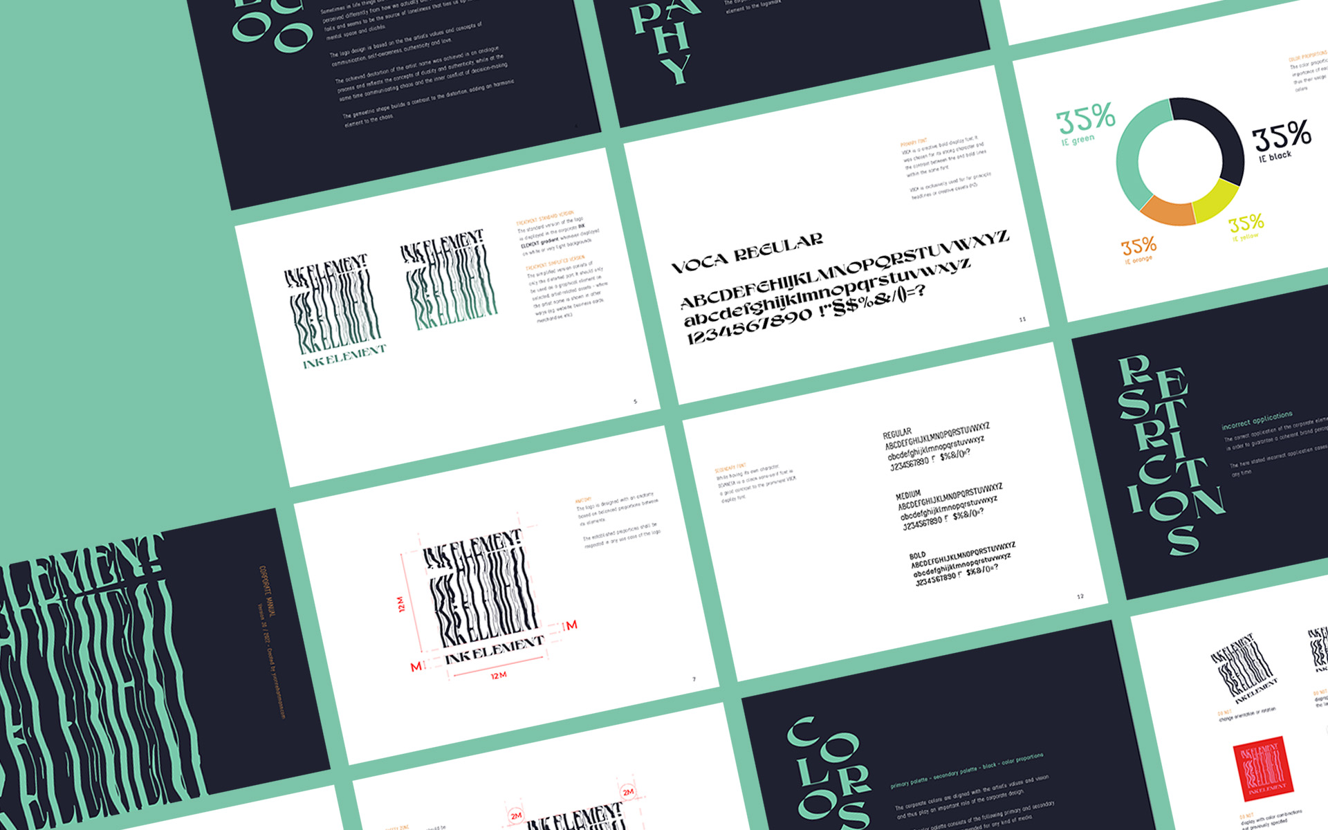
Simply put, a Brand Style Guide (sometimes called a brand book, brand manual or brand bible) is a collection of rules and guidelines that define how your brand is presented visually. It documents everything from your logo and brand colors to the fonts you use for your corporate communication, such as website, newsletters, business cards, etc. It ensures that anyone who creates something for you—from a graphic designer to a venue promoter—gets it right.
It’s the answer to the question: “How should my brand look and feel?”
WHY A STYLE GUIDE IS YOUR SECRET WEAPON
You might think a brand style guide is something only big corporations need, but for a musician, it’s a game-changer. Here’s why:
Your Brand’s Blueprint: A clear style guide makes all your creative choices—from Instagram posts to merch—easier, faster, and more cohesive.
Command Professional Respect: When you send a clear, concise style guide to a blogger, a festival graphic designer, or a PR agent, you instantly signal that you’re a professional who takes your career seriously. It makes their job easier and ensures they represent you correctly.
Consistency = Recognizability: When your Instagram stories, newsletter, and merch all share the same visual DNA, fans start to recognize you in a split second. That consistent look builds a strong, memorable identity in a crowded market.
Unify Your Entire Team: If you work with a photographer, a social media manager, or a bandmate, a style guide gets everyone on the same page. It eliminates guesswork and ensures that every piece of content, from every person, strengthens the same clear vision.
Craft a Professional Image: A cohesive brand makes you look established and trustworthy. It tells the world—and the industry—that you are not just a hobbyist; you are a serious artist building a legacy.
What’s Inside a Professional Brand Style Guide?
A solid brand book doesn’t have to be a 100-page novel. It just needs to be clear and cover the essentials:
1// Intro / About the Brand
Before any visuals, this section defines your brand’s essence. It’s a quick reference for you and anyone you work with to understand the “why” behind the “what.”
Short Description: Your artist story in a nutshell.
Core Values: The 3-5 principles that guide your music and career (e.g., authenticity, innovation, community).
Tone of Voice: How your brand “speaks.” Are you witty and irreverent? Poetic and profound? This ensures your captions, emails, and bios always sound like you.
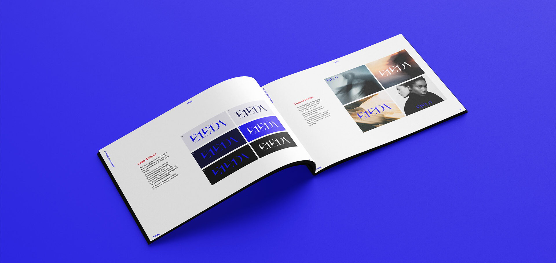
2// Your Logo
This is your signature.
Versions: Your primary logo, a secondary or simplified version, and a black/white version for different backgrounds.
Rules: Clear instructions on sizing (minimum size), spacing (the “safety zone” around it), placement, and, crucially, how not to use it (e.g., don’t stretch, don’t recolor, don’t add effects).
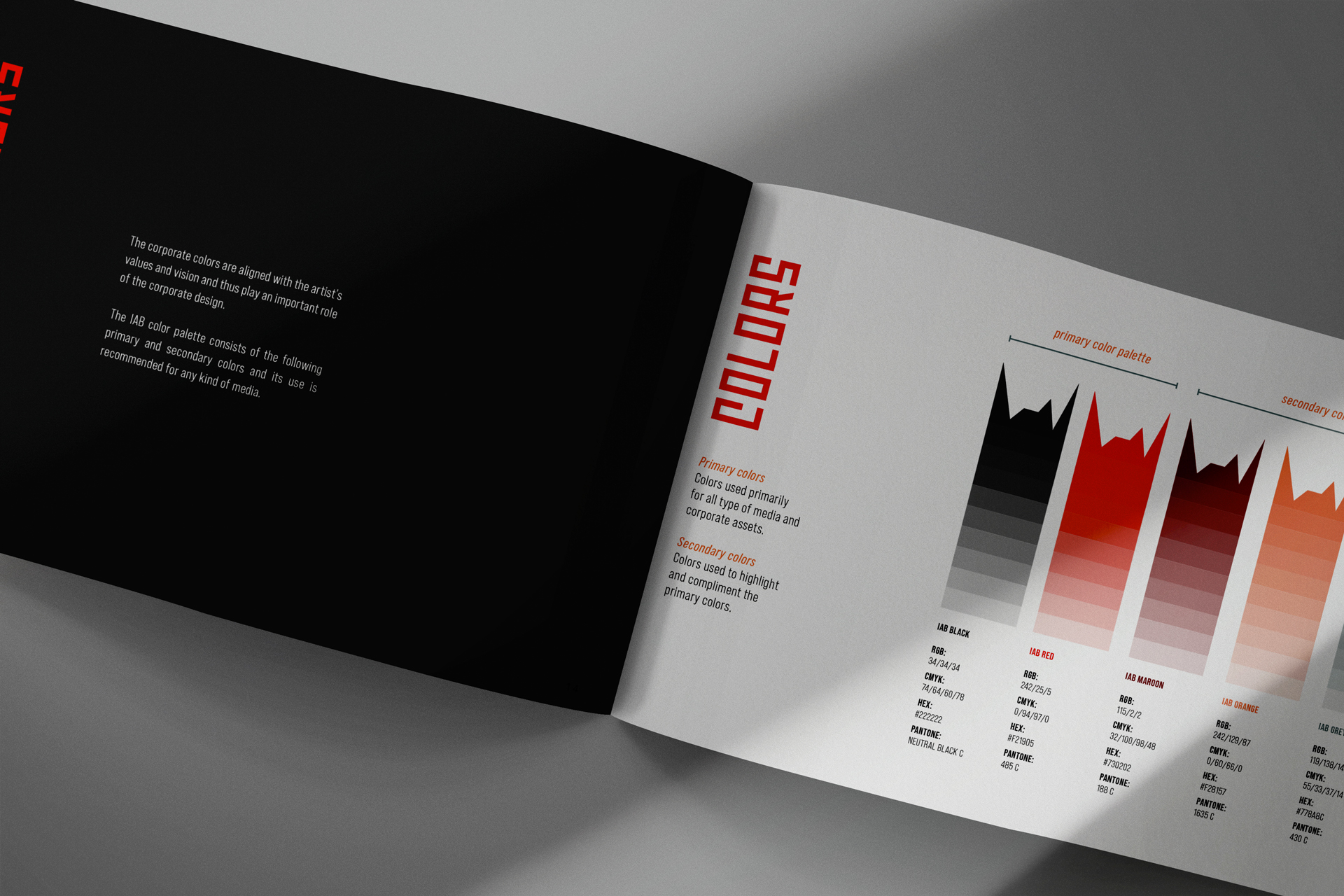
3// Your Color Palette
Colors evoke emotion. Define yours.
Primary Colors: Your 1-3 core brand colors.
Secondary Colors: A complementary set for variety.
Proportional Usage: Guidance on which colors are dominant and which are accents.
4// Your Typography
The fonts you use speak volumes.
Primary Typeface: Your go-to font for headlines and key messaging.
Secondary Typeface: A complementary font for body text (e.g., on your website or in press releases).
Hierarchy: Guidelines for font sizes and weights for different uses.
5// Your Imagery
The style of photos and graphics that represent you.
Photo Style: Is your brand moody and dark? Bright and vibrant? Use examples to show the desired filters, lighting, and composition.
Iconography & Graphics: The style of any recurring graphic elements, patterns, or icons.
6// Contact Details: The Practical Necessity
Ensure opportunities never slip through the cracks. Include:
Primary Contact: For the artist, manager, or label.
Email: A professional contact address.
Social Media Handles: Your official @usernames.
Website: Your central hub online.
Remember: A style guide can be as detailed or as simple as you need it to be. You might start with just the foundation and core visuals, then add more later. The “Intro / About the Brand” section ensures every visual choice is rooted in strategy, while the contact details make it a functional tool for your business.
Check out the style guide we created for Berlin-based duo ELEDA.
BRAND VS. ALBUM IDENTITY
So, you have your Brand Style Guide—your blueprint for consistency. Does this mean every single thing you ever create must look exactly the same? Absolutely not.
Think of your Brand Style Guide as your house’s foundation—consistent and reliable. Your album releases are the interior design for each new room, with their own unique personality and style, while still existing within the larger structure of your overall artist brand.
Here’s how to strategically apply this:
1. Use Your Core Brand Elements for “Corporate” Communication
This is where consistency is non-negotiable. Your core brand elements signal professionalism and stability in all your official business and fan-facing touchpoints. Always use your official logo, color palette, and fonts for:
Your Website & Newsletter: Your digital home base must be instantly recognizable as you.
Business Cards, Letter Heads & Email Signatures: This is how you introduce yourself professionally to venues, labels, and partners.
Other assets: Any other asset such as EPK’s, merch, press shots, etc. that is not tied to a specific release or campaign.
This consistency builds trust and makes you easy to find and recognize in the crowded music landscape.
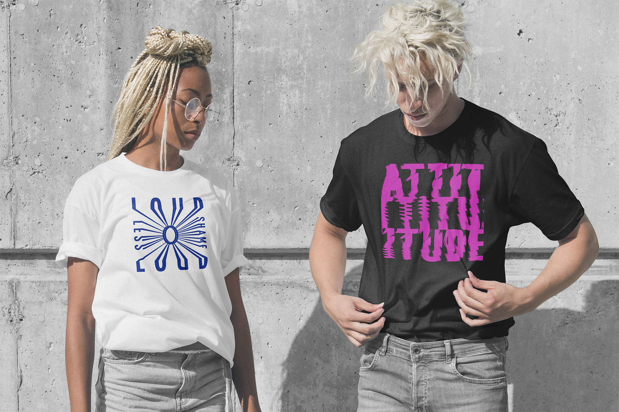
2. Let Your Album Identity Shine for Release-Specific Campaigns
An album or EP is a creative statement with its own story, sound, and emotional core. Its visual identity should be a direct reflection of that. This is where you can—and should—deviate from your core brand guide to create something unique and captivating, while still matching your overarching look and feel.
When designing for a new release, especially in an Electronic Press Kit (EPK) or album campaign:
Create a Sub-Identity: Develop a temporary color palette, typography, and graphic style that embodies the album’s personality. Use these colors and fonts only for release-specific assets (cover artwork, banners, posters, social posts, etc.) – not for your corporate communications.
Keep a Subtle Tether: While the album art itself might not use your brand elements, ensure there’s a subtle link back to your main brand. This could be a specific photographic style, a recurring graphic motif, or simply listing your website in your core brand typography at the bottom of the one-sheet.
This builds excitement for each release as a distinct work, while your core brand remains the anchor for your entire career. Your Style Guide provides professional credibility; giving albums their own identity allows creative freedom. Master both to be a professional business and a dynamic artist.
So, How Much Does This Cost?
Investing in a professional visual identity is a significant step. If you hire a designer for a core package—including a logo, colour palette, typography system, and a basic Brand Style Guide—you should budget for a professional result.
For a complete, custom package from an experienced freelance designer or a specialized agency, a realistic starting range in Europe is typically between €1.500 and €5.000+.
The final rate can vary depending on several key factors:
The Designer’s Experience: A highly sought-after designer will command a higher rate.
Project Scope: The number of initial concepts, rounds of revisions, and the complexity of your requested logo design all impact the price.
Depth of the System: A simple style guide will cost less than an extensive manual covering every possible application.
Remember, you’re not just buying a logo file; you’re investing in a cohesive visual strategy—a strategic asset that will serve your career for years to come.
Your Brand's Blueprint: Get My Free Style Guide Template
I know that investing in a custom design isn’t always possible when you’re starting. But that doesn’t mean you should wait!
A quick but important note: logo design is a highly technical craft best handled by an experienced designer. It requires specific skills to create a vector-based, scalable mark that works everywhere, from a giant festival banner to a tiny social media avatar.
However, you can absolutely learn to define the other critical elements of your brand. In my online branding courses for musicians, I show you how to develop your own brand strategy, define an on-brand colour palette and font system, and establish your photo style. This foundational work will not only save you money if you later hire a designer, but it will also ensure your brand is a true reflection of your music.
To get you started right away, I’m also sharing an exclusive tool:
I’m sharing an easy-to-use Brand Style Guide Template. You can download it as a PowerPoint file and then import it directly into Canva to get started. It will give you a professional structure to fill in your own brand elements, ensuring you can build consistency from day one.
Sign up to my mailing list to get it delivered directly to your inbox.