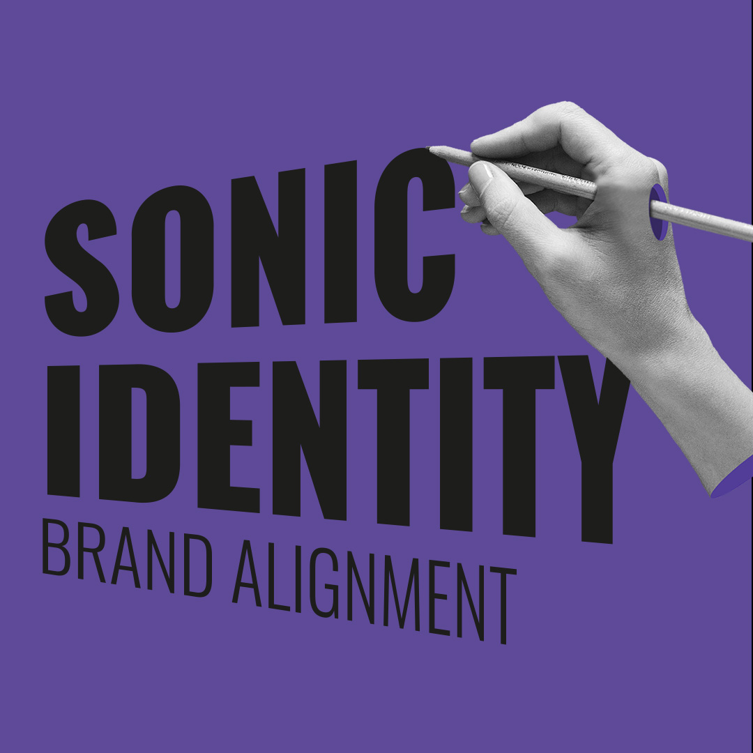
Close
Type at least 1 character to search
Back to top
Your Top 10 Branding Questions Answered

Your Top 10 Branding Questions Answered

For the last ten years, I’ve listened. In your DMs, in calls, in those moments of quiet panic before a release. I’ve collected the ten most frequent branding questions artists, labels, and managers have asked me.

This article is a distillation of that collective curiosity—the top ten branding questions sent to me, answered. I hope they help more of you find the clarity you’re looking for.

1// How do I figure out my 'vibe'? It feels so abstract.

Start with your core personality and your music.

Ask yourself:

  • Why am I doing what I’m doing?
  • What do I want to achieve with my music?
  • If my music was a person, place, or movie, what would it be? (e.g., “a late-night drive in the rain,” “a 70s sci-fi paperback cover”).
  • What 3-5 adjectives do I want fans to use when describing me? (e.g., mysterious, raw, cinematic vs. fun, chaotic, DIY).
  • Who is my music FOR? Visualize your ideal fan. What do they like? Where do they hang out (offline and online)?

Your vibe is the bridge between your sonic identity and your visual identity. Clarity here makes every other decision easier. I help artists build this foundation every day. If you’re ready to do the work and want a clear, structured process (or a dedicated guide), that’s what my “Brand Definition” online course and Brand Foundation Coaching are designed for.

2// How do I write a music bio that isn't cliché or confusing?

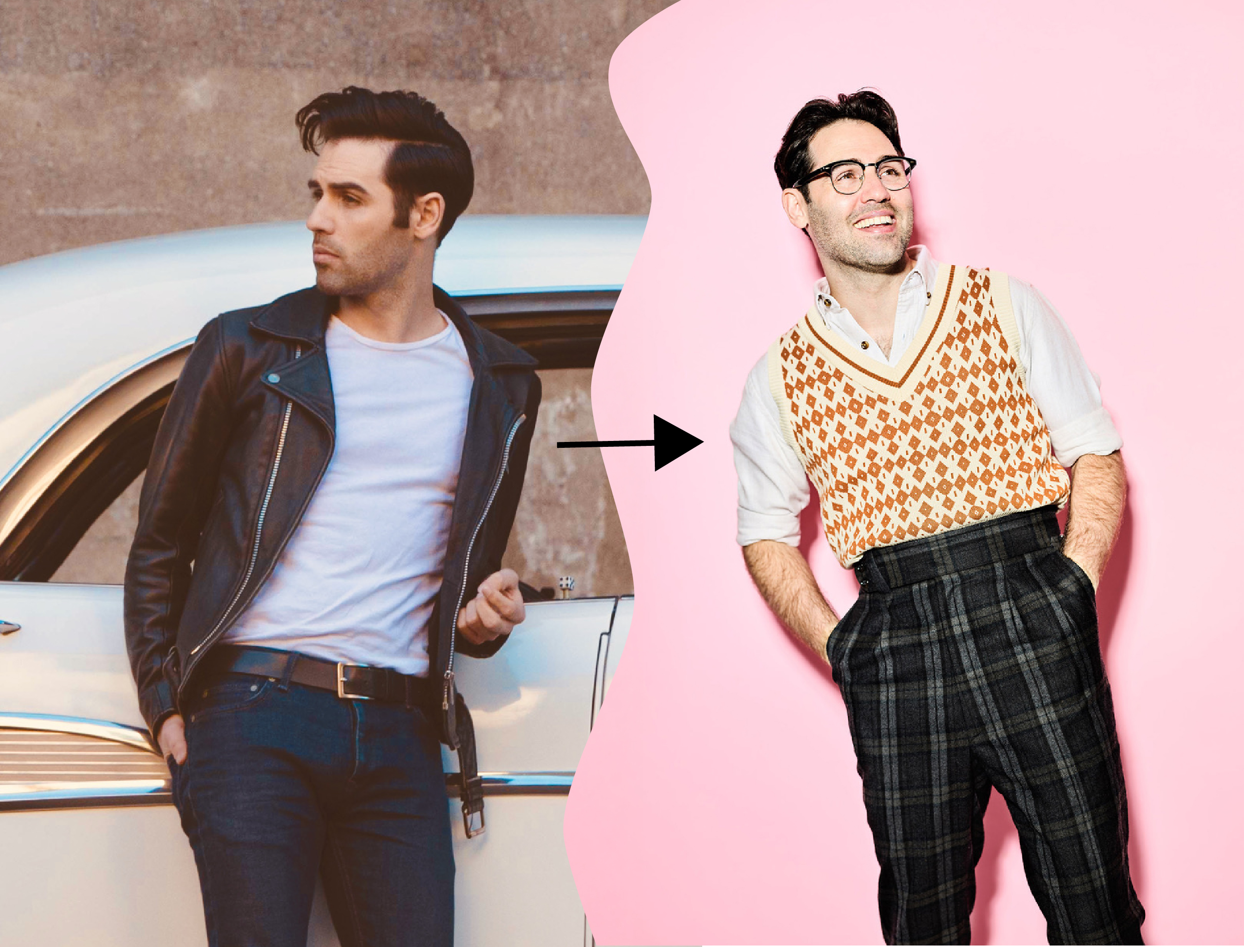
The key is to be a helpful shortcut for busy industry ears. Forget generic adjectives. Use the “For Fans Of (FFO) + Unique Twist” formula. This gives a familiar reference point and your distinctive signature.

❌: “I make authentic, heartfelt music that comes from my soul.” (This describes everyone and gives zero useful information.)

✅: “FFO: The moody atmospheres of Bon Iver and the raw lyricism of Phoebe Bridgers, with a twist of ambient pedal steel and themes of coastal solitude.” or “Think: The big-room energy of Muse meets the intricate storytelling of The Decemberists, delivered with a powerhouse female vocal.”

Tips:
  • Using known artists (“X meets Y”) lets a booker, journalist, or playlist curator immediately place you in a sonic landscape. It answers “What do you sound like?” in seconds.
  • Go beyond the first comparison. Add the Unique Twist—the specific instrument, production style, lyrical theme, or energy that is uniquely you. This answers “Why should I care about you specifically?”
  • Sell the feeling and the sound, describe the experience. Is it “cathartic,” “hypnotic,” “unapologetically joyful,” “cinematic”? Pair that with the concrete sound.

The goal is to make them hear a familiar vibe and then lean in to discover your unique signature in just 2-3 sentences. That’s what gets you booked, covered, or signed.

Gym Tonic live at Synaesthesie Festival 20218 by Yvonne Hartmann

Gym Tonic live at Synästhesie Festival 20218 by Yvonne Hartmann

3// How do I translate a feeling in my music into a visual brand? It just feels impossible.

That “impossible” feeling is common because you’re translating between two languages: sound and vision. The key is to bridge them using specific design techniques that communicate your vibe subconsciously.

This process requires moving from abstract inspiration to a reliable, actionable system—which is where most artists get stuck.

Here’s a starting framework you can use right now:

  1. Define the Core Emotion: Is your music nostalgicdefianteuphoric, or haunted? Pick one primary emotional anchor. (e.g., not just “sad,” but “wistful longing”).
  2. Use the “Sonic-to-Visual” Bridge: Ask: “If this song/album was a physical place, time of day, or texture, what would it be?” A decaying theater? A misty morning highway? Crinkled velvet? These become your visual keywords.
  3. Build a Tangible Mood Board: Collect images, film stills, art, and even fabric swatches that evoke those keywords. Look for patterns in color, light, and composition. 

4// I'm not a designer. How do I create a professional visual style (logo, colors, fonts)?

  • Colors: Limit your palette to 3-5 colors. Choose colors that evoke the emotion of your music.
  • Fonts: Use MAX two typefaces: one for headlines/your artist name, one for body text. Avoid overused free fonts. 
  • Logo: It doesn’t have to be a complex symbol. A distinctive, well-chosen wordmark (your artist name in a unique font) is often more effective and versatile for a new artist.
  • Rule: Consistency over complexity. Using the same fonts, colors, and layout style across channels is more powerful than a different, “perfect” design for each one.

The strategic choice of colors and fonts can significantly enhance your brand and make you recognizable. Random picks and guessing often leads to amateur results and a forgettable brand. 

In my Brand Alignment” online course you’ll move beyond personal preference. You’ll learn how to create your own harmonic brand color palette and typographic system based on design theory and your artistic vision.

In the course I’ll show you different tools that help you set up a color palette that reflects your unique vibe, how to pair fonts based on contrast and intention, and how to create photos that tell your story.

OWN YOUR IDENTITY

Struggling to translate your unique vibe into a visual identity?

Learn to align every aspect of your brand—from your color palette and fonts to your press shots—with your authentic core. 

SONIC IDENTITY - Branding Courses for Musicians (Brand Alignment Course)

5// Once I have established my color palette and typography, do I have to use these on all my album covers?

Excellent question. The short answer is: No, not necessarily.

Think of your established brand elements (colors, fonts) not as a prison, but as a creative foundation and a visual home base. Here’s how to apply them with both consistency and creative freedom:

The Guiding Principle: Cohesion, Not Uniformity

Your audience should be able to recognize your work, even at a glance. That recognition is built through visual DNA, not identical repetition.

WHERE TO USE BRAND ELEMENTS (COLOR PALETTE + TYPOGRAPHY)

Aim for your brand elements to be used for your core communication assets (website, newsletter, business cards, merch (if not album related), general promotional graphics). This builds familiarity.

For album covers, which are sacred artistic statements for a specific project, you have more creative license.

Here’s how to stay connected to your brand:

  • Think of your core brand as the book itself—its themes, its voice, its author. An album or EP is a chapter within that book.
  • Each chapter has its own mood, setting, and story to tell. It deserves its own visual identity (a distinct color palette, bespoke typography) to reflect that unique narrative.
  • However, you don’t want it to feel like a totally different story. What keeps it familiar is your signature style—that consistent creative point of view that fans come to recognize as yours.
Ways to maintain that “same book” feeling:
  • Weaving your signature style—be it grainy film, minimalist composition, or surreal collage—through all your covers.
  • Using a signature anchor like your logo in its consistent form, placed subtly or boldly. It’s the visual signature on every chapter.
  • Employing repetitive composition: A standard layout framework (e.g., central portrait, bordered text) can create a familiar structure for varying content.
  • Creating a Color Dialogue: Letting the album’s new palette speak to your core brand colors, either through a shared tone, a complementary contrast, or by using one core brand color as a through-line.
  • Connecting Through Style, Not Just Elements.
    Cohesion also lives in photographic style (the lighting, grain, and composition.), graphic treatment (use of textures, borders, or layout principle), overall mood (a dark, moody brand can have a dark, moody cover, even if the specific purple hue is different).

Example: Your debut EP might use cool blues (reflecting themes of distance), while your sophomore album bursts with warm reds (themes of passion). They look different, but because both use your signature minimalist aesthetic, consistent logo placement, and a shared typeface for your name, they feel like a cohesive evolution.

This approach gives you creative freedom for each project while building a recognizable and credible artistic universe over time. It’s the strategy all enduring artist brands use.

6// When should I invest money in professional branding (photos, website, logo)?

 Invest when your music is ready for its best possible introduction to the world. Don’t lead with a logo for music that isn’t finished. Instead, follow this priority ladder based on your current goal.

Stage 1: The Foundation (You have 1-2 solid singles)

  • Goal: Look credible and intentional to new listeners on streaming and social media.
  • Priority Investment #1: A Professional Photoshoot.
    • Why: Humans connect with faces. One set of 3-5 incredible, on-brand images is your most versatile asset. 
    • Action: Hire a photographer who understands creative direction, not just portraits. Have a clear mood/vibe in mind.

Stage 2: The Platform (You’re releasing a project and building a hub)

  • Goal: Have a home base for fans and industry to find everything they need.
  • Priority Investment #2: A Simple, Professional Website.
    • Why: It’s your controlled hub for music, tour dates, bio, and press. It’s more professional than just a Linktree and is essential for pitching.
    • Action: Use a template (Squarespace, Wix) but customize it well with your photos and a clear layout according to your vibe. Focus on function: music player, email signup, live videos and photos (if you have) clear contact info.

Stage 3: The Professional Pitch (You’re seeking specific opportunities)

  • Goal: Pass the “first look” test from gatekeepers (labels, booking agents, sponsors).
  • Priority Investment #3: A Cohesive Visual Identity (Logo/Wordmark & Basic Guidelines).
    • Why: When pitching alongside 100 other artists, a polished, consistent look (a sharp logo, defined colors/fonts applied to your one-sheet and socials) signals you’re serious and easy to work with.
    • Action: Hire a designer for a custom logo and a simple brand guide. Apply it to your EPK and social media templates.

The Golden Rule: Start small and specific. A single, powerfully directed photoshoot that gives you 6 months of content is a far better investment than a cheap, generic logo, a basic website, and mediocre photos all at once.

Kavall - press shot by Yvonne Hartmann

Press shot Kavall by Yvonne Hartmann

7// My sound is evolving. Do I need to rebrand completely?

First, take a deep breath. Artistic evolution is a sign of growth, not a branding emergency. The goal is evolution, not revolution.

You don’t need to throw everything away. You need a strategic refresh that honors where you’ve been while making space for where you’re going.

The Guiding Principle:

A full brand makeover is only necessary if both your music and your core artistic identity have fundamentally shifted (e.g., you’re switching from acoustic folk to industrial electronic). If it’s a natural progression or a slight evolution (like your indie-pop getting darker and more synth-driven), then you likely only need thoughtful adaptations, not a reset.

Here’s your 4-step roadmap to navigate the change:

Step 1: The Core Audit (What Stays)

Ask yourself: Have my core values, fundamental message, or target audience genuinely changed?

If you started as a vulnerable folk songwriter and are now making vulnerable indie-rock, your core (authentic storytelling) is the same. The sound is evolving.

Action: Define what is timeless about you. This is your anchor.

Step 2: The Element Audit (What Adapts)

Review your brand assets. Which are flexible, and which are now a mismatch?

Likely to keep (adjust): Your name, your communication voice, your logo/wordmark.

Likely to evolve: Your color palette (e.g., deepen the tones, add an accent), your photographic style (e.g.,shift from bright to moody), your supporting graphics.

Step 3: Introduce Change in a Way That Feels Like You

Your rollout shouldn’t just share a new look—it should embody your brand’s personality.

If your brand is bold and disruptive: Consider a “boom” launch—a clear before-and-after, a striking announcement, and confident, high-energy content.

If your brand is introspective and intimate: Favor a gradual, quiet reveal. Let the new elements appear slowly, almost like a secret shared with close fans, with thoughtful, personal captions.

Action: Choose an introduction style that feels like a natural extension of your artistic voice, not a generic marketing tactic.

Step 4: Make the “Why” Part of Your Brand Story

The narrative behind your evolution is powerful content. How you tell that story should also reflect your brand’s core tone.

For a direct, confident brand: You could share the “why” clearly and assertively—a manifesto, a direct video statement, or bold graphic text.

For a poetic, elusive brand: Think about weaving the reasoning into your art—through symbolic visuals, lyrical captions, or a short film that evokes the feeling behind the change.

This turns a new look into a real bond. Fans aren’t just spotting a fresh logo—they’re following your story. That makes them partners in your journey, not just spectators.

Your rebrand is a new chapter told in your own voice. Let the way you share it be as authentic as the change itself.

Mikey Votano Rebranding

Rebranding for Mikey Votano (check out project HERE)

8// I have more than one persona/projects. Do I need a brand for each of them?

Not necessarily. You need clarity, not necessarily duplicate workloads. The decision hinges on one question: Are you serving the same community with different expressions, or speaking to entirely different crowds?

Consider this framework:

  • The “Artist Umbrella” Approach: You have one main brand (your name) that houses diverse projects. Each project gets a clear sub-identity (its own visual theme, logo mark,..) but it’s always presented as “Your Name presents: [Project Name].” This works if your fans follow you for your eclectic taste.
  • The “Complete Separation” Approach: You create fully distinct brands with separate social accounts, visuals, and bios. This is crucial if the projects could alienate each other’s fans (e.g., children’s music vs. explicit hip-hop).

Ask yourself: “Will fans of Project A feel delighted, confused, or betrayed by Project B?” Their experience dictates your strategy.

Use this checklist to decide:

  1. Audience Overlap: Do both projects appeal to the same person? If NO → Separate Brands.
  2. Creative Goal: Is one a commercial project and the other a personal art experiment? If goals clash → Separate Brands.
  3. Practical Capacity: Can you realistically maintain multiple brands with quality content? If NO → Start with an Umbrella Brand.
  4. Long-Term Vision: Do you see these projects merging or diverging in 5 years? Plan accordingly.

The Bottom Line: You don’t need multiple brands, but you absolutely need to avoid confusing your audience. A confused audience doesn’t engage. Start with clear distinctions, even if they live on one profile initially. You can always separate them later as they grow.

9// How much of my personal life/personality should be part of my artist brand?

This is one of the most nuanced balancing acts in artist branding. The goal is strategic intimacy, not total transparency. Your personal life isn’t your brand, but curated glimpses of your personality can be the glue that builds fan connection.

Here’s a framework that might help you find your line:

The “P.R.I.S.M.” Filter: What to Share

Before sharing, ask if the personal detail aligns with one of these brand-strengthening roles:

  • P – Purpose: Does this illustrate my creative process or my “why”? (e.g., a photo of where I write, a story behind a lyric).
  • R – Relatability: Does this create a shared human experience my fans also have? (e.g., pre-show nerves, a non-music hobby).
  • I – Identity: Does this reinforce a core, positive trait of my artist identity? (e.g., if “curious” is a brand trait, share what you’re reading).
  • S – Story: Does this move forward the narrative arc of my career? (e.g., milestones, lessons learned, growth).
  • M – Mystery: Crucially, does sharing this preserve some intrigue? The most compelling brands aren’t open books; they are intriguing journals with some pages left elegantly blank.
Where’s the Line? The “Relatable vs. Oversharing” Checklist

You’ve likely crossed into oversharing if the detail:

  • Solves a personal problem at the expense of your artistry. (Feuds shift the spotlight from your art to your drama).
  • Is shared in real-time, raw emotion without artistic framing. (Take 24 hours to process; share the lesson, not just the wound).
  • Could make a new listener define you by that single detail rather than your music. (You become “the artist going through a divorce” instead of “the artist with powerful songs”).
  • Feels like it’s for your therapy, not their connection. Your fans are your community, not your confessional booth.
Practical Strategy:

You could structure your sharing like a venue with different sections:

  • Main Stage (Website/Feed): Highly produced, brand-aligned content. This is the “album” of your persona—polished, thematic, and intentional. Personal details here are polished and purposeful.
  • Backstage (Instagram Stories/TikTok): More casual, in-the-moment, and relatable. This is for quick personality flashes, hobbies, and “day-in-the-life” snippets that feel spontaneous but are still on-brand.
  • Green Room (Newsletter/Patron): The most intimate space for superfans, where you can share deeper thoughts, early demos, and more personal reflections. This creates a safe hierarchy for sharing.
The Golden Rule: Share your reaction to life, not just the raw events. 

Fans connect with your perspective, your humor, your resilience—not just the diary entry. You are the artist framing the experience. Your brand is not your diary. It’s your curated gallery of what makes you human, interesting, and connected to your art. Let fans see enough of the person to love the artist, but keep the focus always leading back to the music.

Manthe Ribane live at CO/Pop 2018 by Yvonne Hartmann

Manthe Ribane live at CO/Pop 2018 by Yvonne Hartmann

10// How do we measure the ROI of branding? What are the concrete KPIs for brand strength?

Branding is a long-term equity investment, not a short-term transactional cost. Its ROI is measured in audience loyalty, perceived value, and career velocity, which ultimately drive sustainable streams and sales.

Think of branding like investing in your future. You’re not just buying ads for today; you’re building lasting value. The payoff isn’t just a spike in streams—it’s a loyal fanbase, a stronger reputation, and a career that builds momentum over time. That’s what turns listeners into lifelong supporters and keeps your success growing.

Concrete KPIs for Brand Strength:

Track these metrics before and after a branding investment to gauge impact.

1. Audience Quality & Loyalty

  • Engagement Rate (%) on social media, not just follower count. Are people commenting, saving, and sharing? A strong brand inspires interaction beyond a passive like.
  • Email List Growth Rate & Open Rates. Someone giving you their email is a high-trust signal. A cohesive brand makes them more likely to subscribe and open.
  • Superfan Indicators: Measure increases in merch sales per followercrowdfunding success, or fan-created content (covers, tattoos, art). This shows fans are buying into the identity, not just a song.

2. Perceived Value & Positioning

  • Media & Partnership Quality: Are you getting featured in publications or landing brand collaborations that align with your aesthetic? This signals your brand is communicating a clear, desirable value.
  • Search Volume & Sentiment: Monitor search trends for your artist name and related terms. Is organic search growing? Use social listening tools to track if the adjectives used in conversations about you align with your intended brand traits (e.g., are you being called “cinematic” and “mysterious” as intended?).
  • Price Point Resilience: Can you gradually increase ticket or merch prices without backlash? A strong brand increases perceived value and price tolerance.

3. Career Velocity & Efficiency

  • Conversion Rates on Key Actions: Does your new website/bio/link-in-bio lead to a higher % of clicks-to-streams or clicks-to-ticket sales? Effective branding removes friction and confusion.
  • Pitch Success Rate: Are you getting more responses from playlist curators, labels, or venues? A professional, clear brand reduces the “cognitive load” for gatekeepers and makes you an easier “yes.”
  • Talent Buyer & Industry Feedback: Qualitative feedback like, “Your press kit was the clearest we’ve seen,” is a direct ROI indicator. It means your brand is working as a professional tool.
The ROI Calculation Framing:

Instead of “We spent $X on branding and got Y streams,” reframe to: “Our branding investment reduced the cost and increased the speed of achieving our goals.”

  • It reduces marketing cost by making every asset more effective.
  • It accelerates growth by making your artist instantly more legible and memorable.
  • It builds asset value by creating a scalable, ownable visual world that can be licensed and extended.

The Ultimate KPI: When people recognize your new music or visual before they see your name, your brand ROI is infinite. You’ve moved from being an artist they hear to an artist they follow.

Post a Comment