7 Print Finishing Techniques To Elevate Your Brand
Have you ever considered that the texture of your vinyl sleeve or the sheen on your business card can speak as loudly as your lyrics? This is the magic of print finishing. These specialized techniques are the secret weapons that transform a flat design into a multi-sensory experience, silently communicating your brand’s essence before a single note is played.
While your music lives on streaming platforms, your physical merchandise is a tangible piece of your art that fans can hold onto.
Let’s break down the key print finishings and the distinct vibes they can bring to your musical brand.
PRINT FINISHING TECHNIQUES
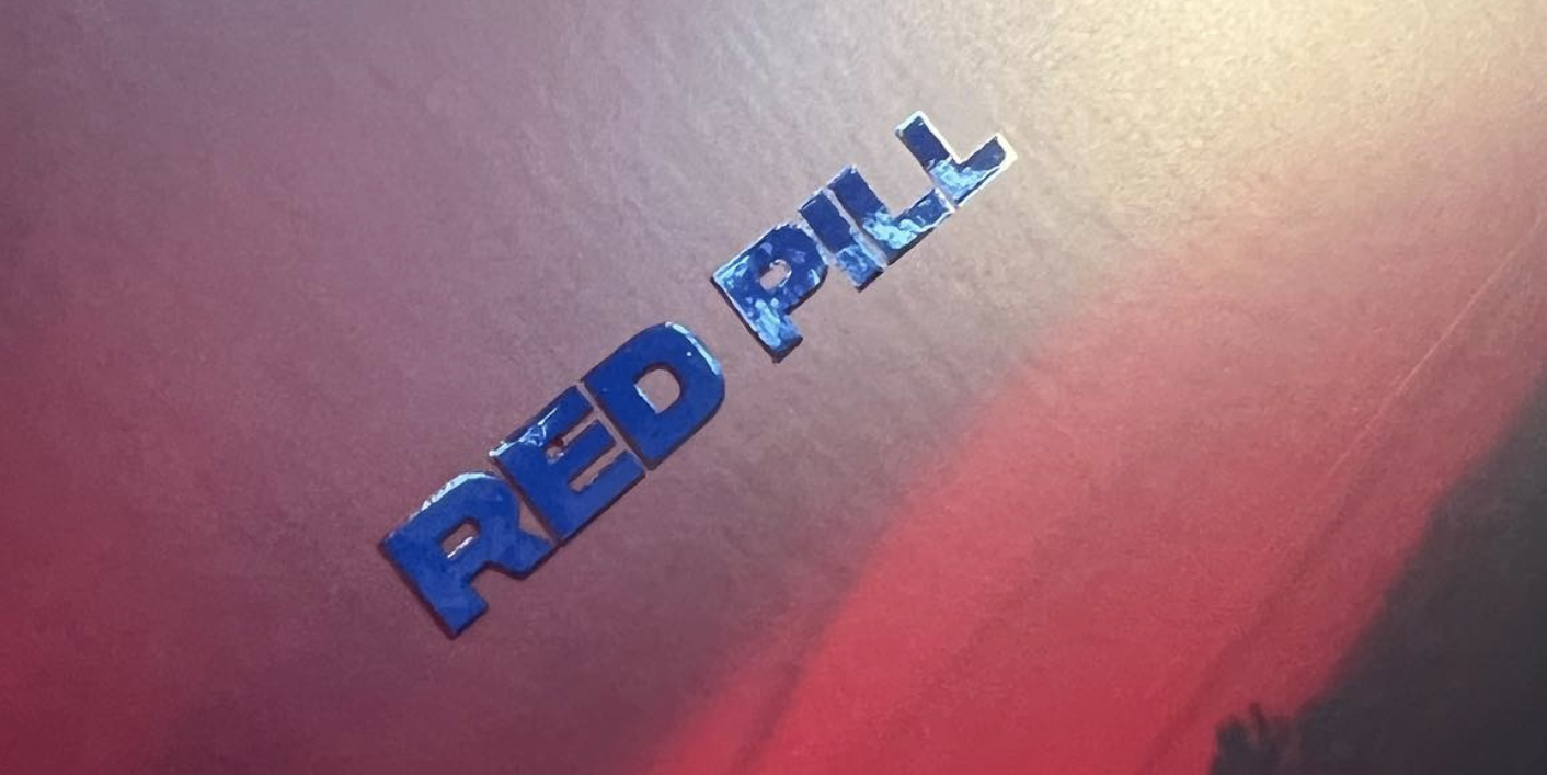
1// UV GLOSS SPOT VARNISH
What it is: A clear, shiny liquid applied to specific areas of a design (like your logo or text) that is then cured with UV light, creating a high-gloss, raised effect.
The Vibe:Modern, Polished, High-Energy. A glossy varnish pops against a matte background, creating contrast and drawing the eye. It feels slick, professional, and attention-grabbing.
Perfect For: Pop artists, electronic DJs, hip-hop artists, or any act with a clean, contemporary aesthetic. Imagine a stark, matte black album cover with just the artist’s name gleaming in a sharp gloss. It says “sharp and confident.”
Photo: Vinyl sleeve of the album Red Pill by Schwarz (with gloss Spot varnish on the album title)
2// EMBOSSING/DEBOSSING
What it is: Using a metal die to press an image into the paper, creating a raised (embossed) or indented (debossed) texture. It’s often used with no ink, letting the shadow play do the talking.
The Vibe:Classic, Elegant, Tactile, Authoritative. There’s a timeless, luxurious quality to the feel of embossing. It suggests heritage, quality, and substance. This print finishing technique makes an item feel important and valuable.
Perfect For: Folk artists, jazz musicians, classical ensembles, or singer-songwriters whose brand is built on authenticity and craft. A debossed logo on a premium vinyl record sleeve feels incredibly sophisticated and timeless.
Photo: Vinyl sleeve of the album Double Negative by Low (debossing finish with ink + spot gloss).
3// Foil Stamping
What it is: Applying a thin layer of metallic or pigmented foil to a surface using a heated die. The results are brilliant, shiny, and impossible to ignore.
The Vibe:Luxury, Glamour, Opulence, Magic. Gold foil screams prestige and success. Silver feels cool and futuristic. Colored foils (holographic, rose gold) can create a sense of wonder, mystique, or fantasy.
Perfect For: Established legacy acts, symphonic metal bands, glam rock, or any artist wanting to project a larger-than-life, celebratory image. A gold-foiled tour poster for an anniversary tour feels like a coveted ticket.
Photo: Holographic foil stamp print finishing on business card for Heartfelt Management.
4// Lamination (Matte & Gloss)
What it is: A thin plastic film applied to the entire surface of a printed piece. It comes in gloss (shiny) and matte (dull, velvety) finishes and is great for protection.
The Vibe (Gloss):Vibrant, Bold, Commercial. Makes colors leap off the page. Great for high-impact festival flyers.
The Vibe (Matte):Subtle, Sophisticated, Artistic. A print finishing that eliminates glare and provides a smooth, premium feel that is understated and modern.
Perfect For:
Gloss: Punk bands, mainstream pop, anything that needs to be eye-catching in a busy merch booth.
Matte: Indie bands, ambient musicians, photographers—any brand that values a refined, artistic touch.
5// LETTERPRESS
What it is: One of the oldest printing methods, where a raised surface is inked and pressed deeply into soft, thick paper. It creates a beautiful, tactile impression.
The Vibe:Artisanal, Handcrafted, Authentic, Nostalgic. Letterpress has a handmade, imperfect quality that feels deeply personal and authentic. It connects to a history of craftsmanship.
Perfect For: Americana, bluegrass, lo-fi indie artists, and anyone whose brand is built on a “handmade,” grassroots ethos. Think limited-run lyric books or business cards that feel like a precious, personal artifact.
6// Metallic Inks
What it is: Exactly what it sounds like—inks that contain metallic powders to simulate the look of gold, silver, copper, and other metals. They are printed like standard ink but have a shimmering effect.
The Vibe:Bold, Energetic, Accessible Luxury. While foil stamping is a separate layer, metallic ink is integrated into the print. It offers a more affordable way to get a metallic sheen with a slightly more organic, textured result.
Perfect For: Almost any genre! Rock bands can use silver for a chrome-like effect, while a folk artist might use a coppery ink for a warm, rustic feel. This print finishing technique is versatile and effective.
7// DIE CUTTING
What it is: Using a sharp, custom-shaped blade to cut through the paper, creating unique shapes and windows instead of just standard rectangles.
The Vibe:Creative, Unexpected, Interactive, Playful. Die-cutting breaks the literal and figurative mold. It shows you’ve thought outside the box and encourages fans to interact with your product—peeking through a cut-out to the CD inside or seeing the world through a unique shape.
Perfect For: Alternative, avant-garde, or psychedelic artists. Bands with a strong iconic logo (imagine a guitar pick-shaped invite or a CD sleeve cut into the shape of a keytar). It’s for those who want to make a truly unique statement.
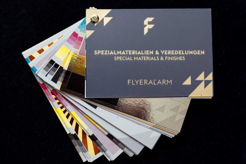
Pro Tip: Get Hands-On Before You Commit
The best way to truly understand the power of these print finishing techniques is to experience them yourself. Many professional printers sell sample kits or “swatch books” that contain small examples of different paper stocks (textures, weights, colors) paired with various finishing techniques like foil stamping, embossing, and spot UV on the same page.
Holding these samples in your hand allows you to:
Feel the texture of a debossed logo vs. a raised one.
See how light plays off of matte lamination versus a glossy spot varnish.
Compare the thickness and texture of different papers.
Investing in one of these kits is an invaluable step in making an informed, creative decision that will perfectly capture your brand’s unique sound and vision. It’s the best way to ensure your physical merch hits exactly the right note.
CHOOSE PRINT FINISHING TECHNIQUES THAT TELL YOUR STORY
Your visual identity is a crucial part of your sonic identity. When choosing a finish, ask yourself:
What does my music feel like? Is it sleek and digital (gloss) or warm and analog (letterpress)?
What is my brand’s personality? Is it luxurious (foil) or authentic and grounded (debossing)?
Who is my audience? Will they appreciate the subtlety of a matte finish or the boldness of a die-cut shape?
By harmonizing your sound with the tactile experience of your merch and packaging, you create a cohesive and memorable brand. Don’t just make something people listen to—make something they feel.
Stuck in the weeds of your brand?
You pour so much love into the details of your brand—the colors, the photos, the messaging. It’s frustrating when that hard work feels like it gets lost in the scroll.
Let’s shift the focus from the endless tweaking to the bigger, more exciting picture: building a brand that truly connects and captivates your audience.
My online courses provide a supportive framework to help you build a consistent and standout brand that truly grabs attention, so you can get back to what you love most—making music.